

Ask ten people what makes a living room look “done,” and a lot of the answers trace back to assumptions that never got questioned — everything should match, neutral is always the safest choice, more furniture makes a room feel more complete. Some of this advice made more sense a decade ago, when showroom-perfect coordination was the goal. In 2026, several of these assumptions are quietly working against the warmer, more personal direction the best living rooms are actually heading.
- Myth 1: “All your furniture should match for a room to look put-together”
- Myth 2: “Neutral colors are always the safe, timeless choice”
- Myth 3: “A living room needs a lot of furniture to feel complete”
- Myth 4: “Trendy design choices always mean sacrificing comfort”
- Myth 5: “Bold colors and personal touches will make a room feel cluttered”
- Myth vs. Reality: Quick Reference
- FAQ’s
- Conclusion
Here are five of the most common living room decor myths, what current design thinking actually shows, and what to do instead.
Myth 1: “All your furniture should match for a room to look put-together”
The assumption: A coordinated set — matching sofa, chairs, and coffee table from the same collection — is the safest way to guarantee a living room looks cohesive and intentional.
The reality: One of 2026’s clearest design shifts is a move away from matching furniture sets and showroom-style coordination, toward pairing a contemporary sofa with a vintage side table, a handmade lamp, and personal photographs and artwork gathered over time. Designers frame this not as a compromise but as the more current, more personal approach — genuinely put-together doesn’t require everything to come from the same collection; it requires a repeated color, material, or shape tying an eclectic mix together.
What to do instead: Keep one unifying thread (a color, a material, a shape) running through your mismatched pieces, and don’t feel obligated to buy a matching set just to appear coordinated. A curated mix, done thoughtfully, reads as more intentional in 2026 than a matched set does.
Myth 2: “Neutral colors are always the safe, timeless choice”
The assumption: Cool grays and beiges are the lower-risk option for a living room, since they’re inoffensive and match anything, while bolder colors risk feeling dated or overwhelming.
The reality: Cool gray palettes that dominated the past decade are specifically fading in 2026, replaced by warmer, earthier tones — terracotta, olive, clay, sand — precisely because designers and homeowners increasingly find pure neutrals cold and impersonal rather than safely timeless. “Safe” and “current” aren’t the same thing, and a room that leans too hard into cool neutrality risks feeling more dated in 2026 than one with a considered warm accent.
What to do instead: Treat warm, earthy tones as the more current default for 2026, reserving pure cool neutrals for specific applications (like a rental where you want maximum flexibility) rather than assuming they’re universally the safer choice.
Myth 3: “A living room needs a lot of furniture to feel complete”
The assumption: An underfurnished room reads as unfinished or sparse, so filling available floor space with more pieces is the path to a room that feels done.
The reality: 2026’s shift toward multiple functional zones and curated, personal pieces isn’t about quantity — it’s about intentional selection. A room with fewer, well-chosen pieces (a meaningful vintage find, one curved statement chair, a thoughtfully built small gallery wall) often reads as more complete and considered than one that’s simply filled with furniture to occupy space. This is particularly true in smaller rooms, where restraint reads as intentional and overfurnishing reads as cramped.
What to do instead: Prioritize pieces that genuinely matter or serve a clear function over filling every available surface or wall, especially in smaller living rooms where fewer, better choices consistently outperform more furniture.
Myth 4: “Trendy design choices always mean sacrificing comfort”
The assumption: Following current design trends — a curved sofa, a statement color palette, a carefully curated gallery wall — means prioritizing how a room looks over how comfortable it actually is to live in.
The reality: 2026’s biggest throughline is arguably the opposite: low, deep, relaxed seating that specifically encourages lounging over formal, upright sitting; layouts designed around actual daily use (conversation, TV-watching, relaxing) rather than a formal showroom arrangement; and a broader move away from “showroomy” perfection toward rooms that feel warm, lived-in, and loved. The current trend direction is comfort-forward, not comfort-sacrificing.
What to do instead: Feel confident that following 2026’s design direction and prioritizing comfort aren’t competing goals right now — choosing a low, deep sofa or a relaxed, zoned layout is simultaneously on-trend and genuinely more livable.
Myth 5: “Bold colors and personal touches will make a room feel cluttered”
The assumption: Sticking to a simple, restrained palette and minimal personal decor is the safer way to avoid a room feeling busy or chaotic.
The reality: As maximalism evolves in 2026, it’s showing up less as loud, over-the-top statements and more as texture, rich neutral palettes, and thoughtfully curated gallery walls that tell a personal story — the goal explicitly isn’t clutter, it’s personality. A room with zero personal touches can feel just as unfinished as one that’s genuinely overstuffed; the difference between “curated” and “cluttered” comes down to intentional selection and a unifying thread, not the sheer number of personal or colorful elements present.
What to do instead: Don’t equate restraint with safety — a thoughtfully curated room with personal photographs, collected objects, and a considered color palette is different from clutter, and 2026’s design direction actively favors that kind of personality over a stripped-back, impersonal minimalism.
Myth vs. Reality: Quick Reference
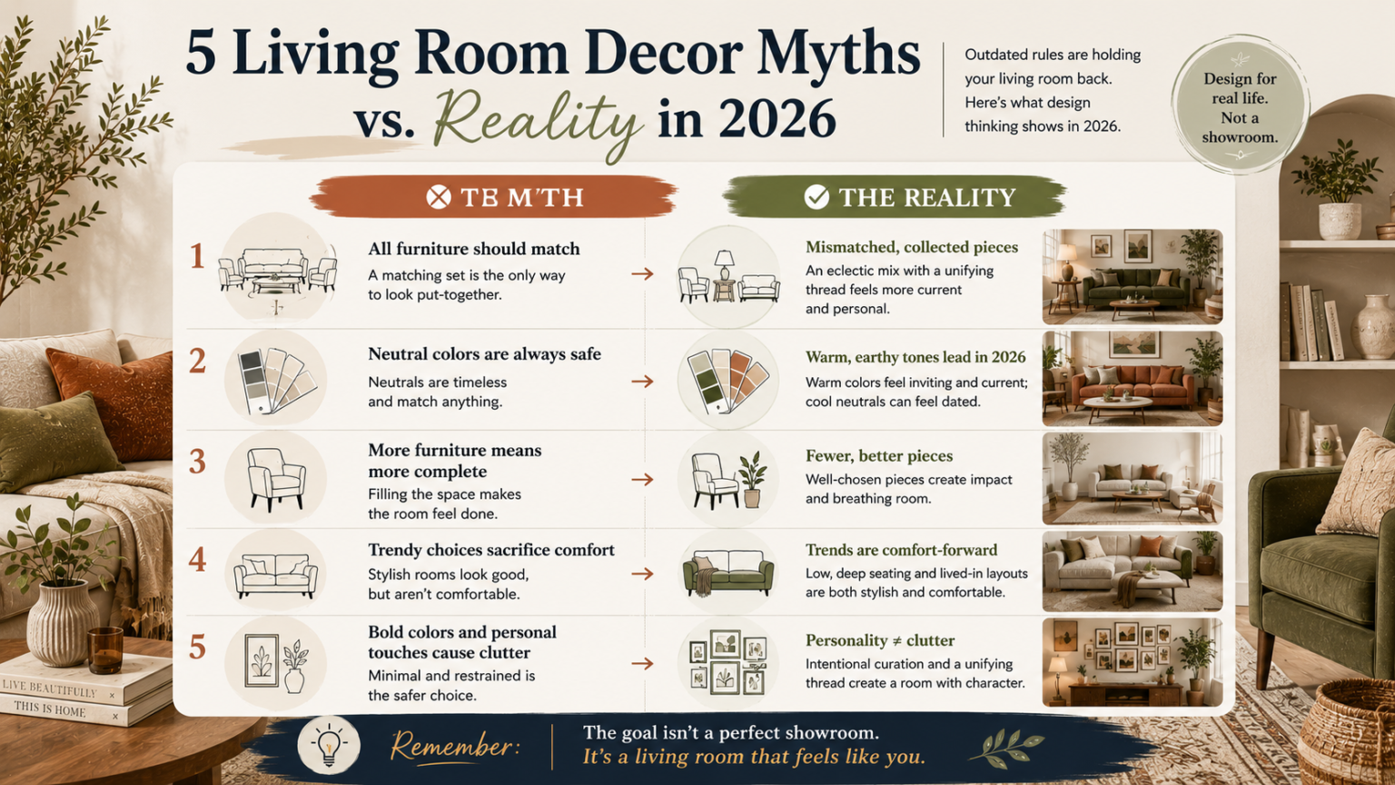
| Myth | Reality |
|---|---|
| All furniture should match | Mismatched, collected pieces (with a unifying thread) are the more current, personal choice |
| Neutral is always the safe choice | Warm, earthy tones are the more current default in 2026; pure cool neutrals can feel dated |
| More furniture means more complete | Fewer, well-chosen pieces often read as more intentional, especially in smaller rooms |
| Trendy means sacrificing comfort | 2026’s biggest trends are explicitly comfort-forward (low seating, lived-in layouts) |
| Bold colors/personal touches cause clutter | Clutter comes from lack of intentional selection, not from color or personality itself |
FAQ’s
If I already have a matched furniture set, do I need to replace it to be on-trend?
No — you can introduce the mismatched, collected look gradually by swapping in one or two pieces with more character over time, rather than replacing an entire existing set at once.
Is it risky to move away from neutral colors if I’m not confident in my color choices?
Start small — warm-toned textiles, artwork, or a single accent piece let you test the direction before committing to paint or larger furniture, reducing the risk of an color choice you’re unsure about.
How do I know if my room is “curated” or actually cluttered?
Look for a repeated color, material, or shape tying the pieces together, and check whether each item in the room serves a clear function or genuinely matters to you — if most pieces pass that test, the room is curated, not cluttered.
Does choosing comfort-focused furniture (like a low sofa) mean sacrificing a polished look?
No — 2026’s design direction specifically pairs low, relaxed seating with a considered, personal aesthetic; comfort and a polished, intentional look aren’t in tension in current design thinking.
Conclusion
None of these five myths are unreasonable on their face — they’re mostly holdovers from an era when showroom-perfect coordination was the goal, and they haven’t been re-examined against how living rooms are actually being designed in 2026. The pattern across all five: the current design direction favors personal, considered, comfort-first choices over rigid rules about matching, neutrality, and restraint. Test these assumptions against what actually makes your specific room feel good to live in, not against an outdated idea of what “put-together” is supposed to look like.
Design trends, product availability, and pricing for home decor items change frequently. This article reflects general design guidance current at the time of publication; always assess your own space, budget, and personal style before making purchasing or renovation decisions.